

In the world of creative marketing, a book, brochure or magazine’s front cover design is king.
“Never judge a book by its cover” so the saying goes. But the truth is the opposite – the consumer always makes a judgement of the publication from its first glance. Purchasing and selection decisions are made or broken by first impression and that’s why the front cover design of a book, a magazine or a brochure is valued highly.
In the case of both trade magazines and company brochures, creating good cover designs are the result of designers understanding the four basic rules:
- Know your limitations – of the brand style, brand heritage, the existing template, available space, etc.
- The goal is king – the design needs to truly engage with the audience for them to want to take the next step (and pick it up, read it). That is the goal, after all.
- Tell the story – the front cover design needs to be relevant and set the tone for the style, direction & emotion of the content within. Confusing the recipient before they even read it is NEVER a good idea.
- Keep your ego at the door – not all front cover designs have to be unique, crazy or award-winning. Never rule out a tried and tested design style or template especially if they have been proved to work!
So, ultimately, it is all about understanding what it is that the company brochure or magazine is promoting and understanding who are the recipients. And, from there, to ‘link the design to the message’.
If the publication is a catalogue of products, you may decide to include some product imagery on the front cover. However, if it is a company brochure that is trying to promote the ‘values’ of its services, the front cover design should appear more corporate with a leaning toward those values.
CASE STUDY: CKH GLOBAL
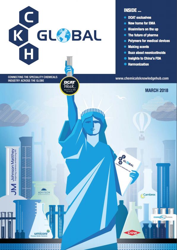 CKH Global is a recently launched B2B magazine aimed at the chemicals, pharmaceuticals & cosmetics industry and published by Speciality World Media.
They had approached Design Inc for creative support for the front cover design of their March 2018 edition as they felt they needed something creative, unique, impactful and relative.
Taking on the project, it was imperative that we understood the type & style of content, its readership and whether it already had a ‘template’ within which we were required to work.
The more questions we asked, the more we learnt and the better positioned we were to propose a design.
We found that the publication would be partnering with DCAT (Drug, Chemical & Associated Technologies Association) and being promoted at their flagship event, DCAT Week ’18 in New York during March. As such, the publication would heavily feature a number of DCAT-relevant articles.
Our designs provided a connection between New York and the industry through the use of an illustration of the Statue of Liberty in front of a number of skyscrapers shaped like chemical bottles. In addition, we had added signage to the skyscrapers and, with their permission, included corporate logos of the event’s main exhibitors.
Furthermore, with the Statue of Liberty normally holding a tablet in her left hand and a torch in her right, we used this to our benefit by promoted the publication’s logo on the tablet and the DCAT Week event logo within a round bottom flask in her hand.
Finally, the artwork was perfectly formatted to complement the publication’s existing template with print-ready files supplied directly to the publisher.
The result: a new front cover design that hit the brief head on. Creative, unique, impactful and highly relevant to the message. Moreover, the client loved it so much that they have requested this cover design style be for all future publications.
Designing a front cover for any publication – whether this be a book, magazine, brochure, newsletter, prospectus or catalogue – is a strategic project. Making it look good is useful but, making it achieve its goals, is crucial.
Design Inc have been providing brochure design, magazine design and newsletter design services for over twenty years with clients coming from all industry sectors. If you would like to discuss your own brochure requirements, whether it is for a front cover design or the design & print of a whole publication, do give us a call – we would be delighted to hear from you. Contact Frank Norman on 01784 683000 or by email.
A selection of other front cover styles designed by Design Inc:
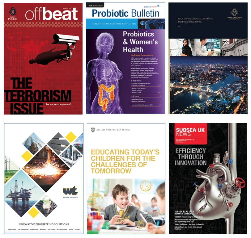
- Offbeat. This is an internal newsletter from Surrey Police. The main features within this publication were about terrorism and surveillance. our design was a gritty Banksy-esque style of a surveillance camera with an armed police shadow.
- Probiotic Bulletin. This is a quarterly newsletter from Yakult’s science division, promoting the science behind the healthy gut bacteria. The main article in this issue was regarding research into the product on women’s health. As such, we created a see through female body with a focus on the gut area.
- London International Patients. This is a company brochure promoting the company’s care services utilising London consultants. We introduced a series of imagery suggesting the patient, the consultant and an aerial shot of London.
- Watson-Towers Group. This was a company overview brochure for an engineering company focusing on their main skillsets, services and industry sectors in which they work. The front cover design was based on a brand style (we had previously devised) featuring various images suggesting these products, solutions and sectors.
- Staines Preparatory School. This was the school prospectus. The design was created to depict vibrancy in the classroom, showing an engaged child overlaid with childlike illustrations of everyday items.
- Subsea UK News. This is a quarterly magazine issued by the subsea industry’s governing body. This issue featured a main article regarding new efficient innovations within the industry. The innovative design featured a steampunk-style, working heart.
>>The Art of the Magazine Cover
>>The Creative Art of Magazine Design & Publishing
>>Designing for a Company Magazine or Newsletter