
Surrey RoadSafe, formerly Drive SMART, is the local road safety partnership of four public sector organisations: Surrey County Council, Surrey Fire & Rescue Service, Surrey Police and National Highways. All working together to help reduce the number of road casualties in Surrey.
Their recently launched Surrey RoadSafe website is the culmination of Design Inc’s involvement with the partnership, which started back in 2022 when we first won the pitch to devise the new brand identity.
The initiative was first implemented in 2009 under the Drive SMART name. At that time, the focus was solely on the education around anti-social driving. However, over the years, the focus has shifted towards other road users, not just the driver.
In turn, this had led to the requirement for a new brand identity – one which would be more inclusive and engaging to all users and therefore repositioning the partnership to better educate more about road safety and the part everyone can play in the drive towards reducing those killed and seriously injured on the roads of Surrey.
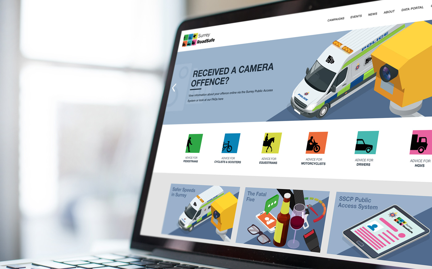
Working closely with the partners, we had shortlisted the six core types of road user they were looking to reach. These were:
Driver (personal),
Driver (business)
Motorcyclist
Cyclist
Horse rider
Pedestrian
With that knowledge, the Design Inc branding team set to work designing the logo. We knew wanted the result to be a brand that was instantly recognisable, understandable and highly memorable. moreover, it was decided that simplicity was the key.
The result didn’t disappoint. Our solution utilised simple silhouettes of the six road user types – the inspiration coming from the designs of road traffic signs. Each silhouette was styled within its own individually coloured box and positioned to be moving into view from the left hand edge.
The boxes were brought together in a 3×2 rectangle and positioned to the left of the brand name which itself was designed to be clear and bold. This was helped through the use of a simple font and the creation of a non-word; ‘RoadSafe’.
To further strengthen the Surrey RoadSafe branding, each individual square from the logo was set up and supplied to the client to be used when their own marketing called for direct comms focused on an individual user type.
But the brand logo was only the start of the project. The illustration style graphics subsequently provided the inspiration for other marketing comms including Surrey RoadSafe’s Winter 2022 OOH advertising campaign which appeared on the side of the buses covering twenty bus routes throughout the county.
The advertising was updated for the 2023 campaign which also the addition of animations appearing on various social media platforms.
And, finally, towards the end of 2023, we expanded the Surrey RoadSafe branding style to include more specific, colourful illustrations for the new website. We are happy to see the new website launched and proud to have been involved with a most important project.


