A positive outlook on negative space
Back to BlogDesigners will always tell you that 'less is more'. And there is no better example to back up that statement than when looking at negative space illustrations - especially brand logos.
Back to Blog
Negative space – sometimes known as white space or empty space – is the term used in marketing to describe the space surrounding a subject within a design. More often than not, this space is empty, devoid of detail so as to ensure the eye’s focus remains on the core subject. Ask any designer, and they will tell you never to be afraid of white space and to simply let it do its job.
Sometimes however, designers like to fill the space. Sometimes, it’s simply because they are uncomfortable with the ‘less is more’ approach and, just like a conversation that has gone quiet, they feel the need to fill the void.
But, at the other end of the scale, some designers are strategically creative and utilise the negative space to form compelling visuals that have dual or hidden meaning themselves. When designed well, the negative space can add much more value to the image without the need to add extra clutter.
One area of design where designers strategically use negative space is in the creation of brand logos. This is not the case for all brand logos of course, but it is always good to see well-executed examples. Especially where the shape of the negative space is directly associated with the company & or its solutions, services or values. Moreover, when the shape is ‘hidden’ well within the logo it can create additional delight upon its ‘discovery, serving to establish increased perceived value to a company’s brand; clever, strategic, relevant, considered, etc. And, most definitely, memorable.
One of the best-known example around is the FedEx logo, in which the negative space between the last two letters depicts the shape of a forward moving arrow.

The FedEx logo appears deceptively simple – in so much as the whole arrow shape just appears perfectly ‘hidden’ within the available negative space. Other than the selection of the appropriate font and positioning of the letters, no additional manipulation was required to achieve the shape of the space. However, for most negative space logos, the hidden element often needs to be manipulated to suit.
Let’s look at some examples.

Mountain and bear
Did you know the Toblerone logo has a hidden bear within? If not, then you may only have a short time to see it, as the brand is soon to change its logo due to Switzerland’s ‘Swissness Law’ dictating that only chocolate which is wholly manufactured in Switzerland can show the iconic Matterhorn. And, as part of its production is moving to Slovakia, the iconic logo will soon be changing.
You can find Toblerone in all airport duty-free shops worldwide – so take a look next time you’re passing through.
The Toblerone logo depicts a snow-covered Matterhorn. And, if you look closely, you will see that the white space where the snow is, has actually been strategically designed in the shape of a bear.
And why a bear, you ask? Well, that because the chocolates were produced in Bern – also known as the City of Bears. Such a shame it needs to change.

Pen and spoon
Here is a fantastic and simple example of how best to utilise negative space.
The two elements work so well together, you would not even think they were manipulated to appear that way.
Now, in its 40th year, the Guild of Food Writers is a professional association of food writers and broadcasters in the United Kingdom.
The association has a brand logo that explains what they do in the most simplistic way – by combining two shapes that depict writing and food. Specifically, the shape of the nib of a fountain pen and within it’s negative space, the perfect shape of a spoon.
Simple, highly effective and very relevant.

Tree and animals
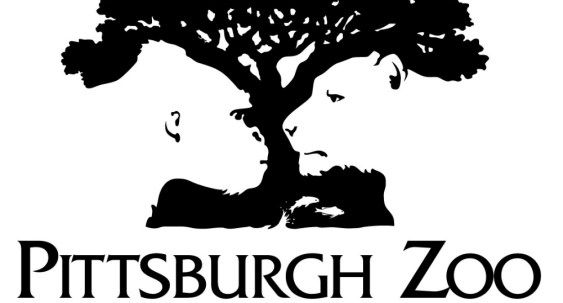
What do you see here? A tree or two animals facing each other. The answer of course, is that you see both – and that’s the point of this negative space logo, where both elements have equal prominence within the visual – in much the same way that the faces & candlestick graphic works.
The designers behind the Pittburgh Zoo brand, started with the head shapes of the animals – in this case the gorilla and lion – and styled the shape of a tree around them. But, by making the tree to be the positive colour and the heads the negative, the design is rebalanced to ensure equal prominence to both elements. As such, it appears as though the heads perfectly fit within the tree and vice versa.

Pencil and mountain
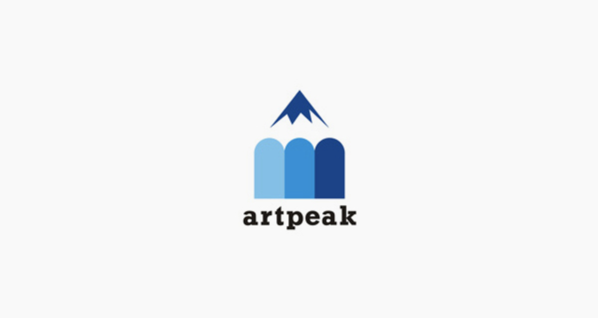
The Artpeak brand logo is another fine example of the use of negative space. And, in this case, the negative space acts as the connection between two separate images.
The logo is obviously the top of a pencil but, by
a) restyling the shape of the tip and
b) deliberately not showing the grey part of the sharpened pencil, the mind also sees this as a snow-covered mountain peak.
Whether or not the brand name came before or after the logo design, we cannot say but it is a great example of a perfect juxtaposition.

Woman and Australia
The Yoga Australia brand logo is another perfect example of a negative space logo. The shape within the women’s pose clearly matches the shape of Australia. The shape of the pose does feel out of place. Instead, it appears to the natural shape for that pose. Of course, the shape of the continent within is not designed perfectly to scale but it is close enough to recognise.
It would be interesting to learn from the designer regarding when, in the creative process, they thought about pursuing this idea. But, we are glad they did because this example is ideal.
There are many examples of negative space in brand logos. Search for ‘negative space logos’ and hundreds will come up. But, just what does it take to create a truly great example? In our opinion, this comes down to four key traits.
Make it relevant
The shapes of the positive and negative spaces need to be relevant to the brand in some way. This may relate to the brand name, its products & solutions or simply the company values. Of course, this is true of the elements in most logos but, even more so when creating the juxtaposition in a negative space logo.
Keep it natural – don’t force it
Good negative space logos occur when the negative space appears natural within its surrounding rather than the logo being deliberately forced to fit and looking out of place.
Balance between positive and negative
The negative space should never create more impact than the positive. Creating a balanced logo where the negative space has just as importance & relevance as the positive can be key.
Create the eureka moment
Good negative space logos create a ‘eureka’ moment when the hidden element is ‘discovered’. This helps the brand be seen as ‘clever’, ‘thoughtful’, ‘considered’, etc.
The branding team at Design Inc love negative space logos. We hope you do too and, if you have seen any that you would like us to share, just send us the link.
