
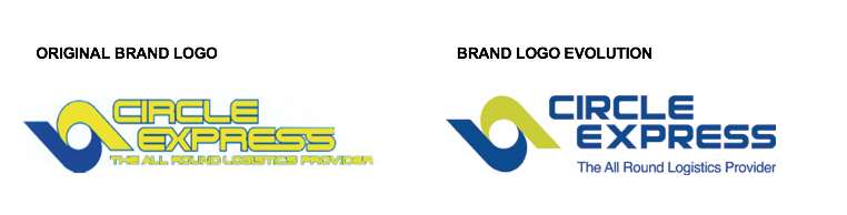
Design Inc is proud to be the creative branding agency behind the new brand for freight specialist Circle Express. In fact this is not a new brand at all but rather a creative and strategic brand evolution of the existing and well-known brand marque.
When it comes to corporate rebranding, subtlety is often the key. Most corporations don’t have the need or luxury of throwing everything away and starting from scratch, so often a designer is called upon to give a brand identity a modernised look through a fine-tuned subtle update. It is, of course, important to understand the history and values of the existing brand. And that means understanding where it has come from? why it was created? what does it still achieve?
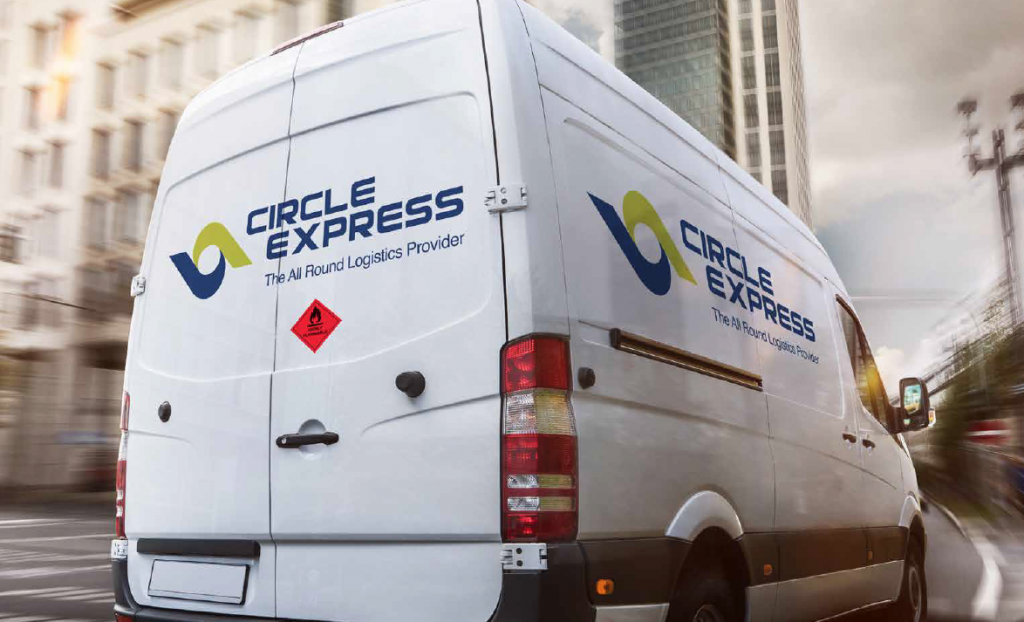
And, in the case of the rebranding of Circle Express, although the company’s management team were open for a wide-ranging pitch, including a clean sheet approach, it was obvious to us that the existing Circle Express identity possessed too much brand equity for it to be replaced. Not only was the original brand already very well respected and recognised but the company also has a lot of existing, costly branded assets, such as hundreds of vehicle liveries, uniforms, signage as well as printed collateral pieces still using this logo. As such, we strongly pushed for the first brand concept to be a ‘refreshing’ of the existing brand that could be implemented with a soft approach over time.
Although appearing somewhat outdated in execution, the original Circle Express brand already symbolised a two directional movement (depicting delivery and collection) ‘wrapped’ in stylised caring ‘hands’ shapes around a circle. And, with both the company’s name and service offering remaining, a gradual step-by-step approach to the re-visualisation of the brand was the best use of resources. Rather than a wholesale change.
The new brand logo is now sufficiently different to showcase a more modern approach but, at the same time, it retains enough of the existing style & brand values to ensure long-term customers of a continued service level.
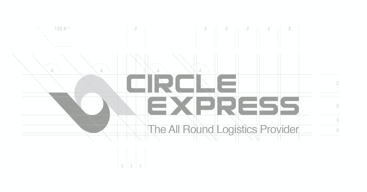
Compared with the original brand, the new Circle Express logo has been differentiated through modernisation: a better use of colour, styling and positioning.
The colours used here are still blue and yellow(ish) but have been brought in line with the brand colours of their parent company, Rico Group. Furthermore, whilst we have retained the strong & secure font style (albeit with some subtle tweaks), the uncomfortable & confusing keyline has been removed and the letters have been carefully kerned. Moreover, the company name now stands more confident in its darker blue.
Overall, a very satisfying result to an interesting project.
David Parker, Design Incorporated’s Brand & Marketing Specialist said: “We took the best of the brand’s heritage – reflecting the logo’s decade of origin – which is something you will see in all the sectors’ household name brands – whilst reinventing the marque to inspire the future business plans. We unravelled what makes Circle Express a great freight partner and teased out the strands of the brand’s weave to tailor a new outfit for a market leader.”
Tom Ryan, Managing Director, Circle Express commented: “We’re delighted to be unveiling our fresh new look, one that simultaneously recalls Circle Express’ freight heritage while also bringing the brand up-to-date. Our trademark symbol is still instantly recognisable, as is the familiar Circle Express name, but by modernising the design we’re indicating a step-change that mirrors a change in our customers’ needs. It’s an exciting time for both us and our customers – old and new.”
Be confident to consider a brand evolution rather than a revolution
For any branding agency, it is important, when embarking on a new brand journey for any company, to understand what ‘good’ the existing company brand possesses. The branding process should always look to leverage the company values and, if there are elements within the existing brand that already showcase those values, then agencies should be confident enough to consider a brand evolution rather than a revolution.
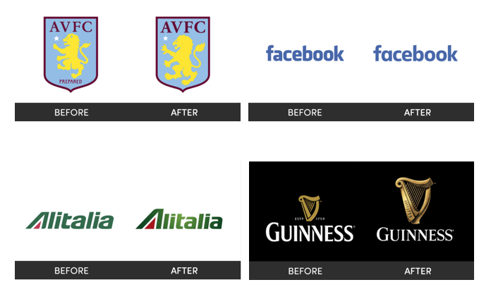
And, sometimes, the evolutionary leap is not far at all. And this can be seen in many well-known cases, for examples of which can be seen here:
Aston Villa Football Club – redrawn icon
Facebook – heavier font
Alitalia – change of font style and addition of a light source
Guinness – stronger focus on the icon
There are many many more examples out there and some so subtle that you may never have noticed. And this does beg the question of why it was done in the first place.
It is all about ensuring the brand values perfectly align with the company values and, of course, companies are always changing, growing, adapting. Moreover, they are often introducing new products, services & solutions which attract new customer bases from new regionsB
View our Branding Portfolio including further examples of brand evolution projects.
View our Freight & Logistics Portfolio
For more information about Design Incorporated’s brand evolution services please contact Frank Norman on 01784 683000 or by email