
Branding for the freight sector: Wallis Freight.
For over 21 years, Design Inc has been providing creative, marketing and branding for the freight sector. Of course, being based close to Heathrow with hundreds of freight & logistics companies around us, we are ideally placed to help make them, and their marketing collateral, truly stand out from the rest.
The recent branding project for Wallis Freight was one such example. Having been recommended to us by another company within the logistics sector, they approached us for support in the creation of a new brand identity for their ‘everyday’ freight and ‘special logistic projects’ business.
Wallis Freight pride themselves on providing a combination of everyday service reliability and special logistics project capability. They are a new company brought to market by experienced logistics professionals providing an intelligent and proactive service for a wide range of clients.
They were seeking to develop a brand identity which could not only set them apart in a traditionally structured and price-focused sector, but also reflect how they truly identify a customer’s needs to build business advantage. Wallis genuinely want to be perceived as different.
In practical terms, the factors behind the task of delivering a brand for Wallis were identified: 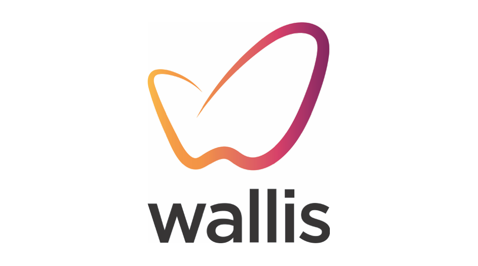
– Wallis Freight were looking for an identity that will have timeless appeal and give a grown-up brand feel.
– To build brand promise, to mean something and provide value in the future.
– Positioning of services or divisions needed to be given some consideration.
– A ‘less is more’ approach was to be adopted.
– The name Wallis already brought an element of personality to the mix – this needed to be managed.
– A colour coding palette enabling differentiation/navigation between future company divisions should be also given some consideration.
In practical terms, branding for the freight sector has the same set of processes as for other sectors but, within a competitively dense area such as Heathrow, creating ‘impact is even more important. And, as such, it was crucial to get under the skin of this business to understand what is was that made them truly unique and how they were able to provide ‘extra value’. Our strategic approach enabled us to gain insight of the inherent values of both the company and its services/solutions. And, knowing these allowed us to understand the unique benefits and value to their clients.
So, the first stage was to help shape the ‘brand personality’ of the company. Through the establishment of a long-list of values and following a ranking exercise, our focus was narrowed to the highest ranking company values.
PRIMARY VALUES
Bespoke
Consultative
Agile
SECONDARY VALUES
Experienced & knowledgeable
Credible & trustworthy
Agile
Human (-faced)
Global reach
Technology-driven
Total support
Following this process the Design Inc branding team met to broadly map out the strategy that would ultimately deliver the new brand. Discussion took place on the identity’s structural elements, typography, illustration styles, etc.
As well as being representative of one or more of these values, development of a device based on a stylised ‘W’ was prevalent in many of the early ideas. And, from the 6 concepts presented, 2 frontrunners were identified by the Wallis Directors as being the most appropriate and relevant top them. One with a very fluid feel (depicting consultative movement), another more rigid and grid-like (depicting a puzzle that could be deftly navigated by Wallis’ agility).
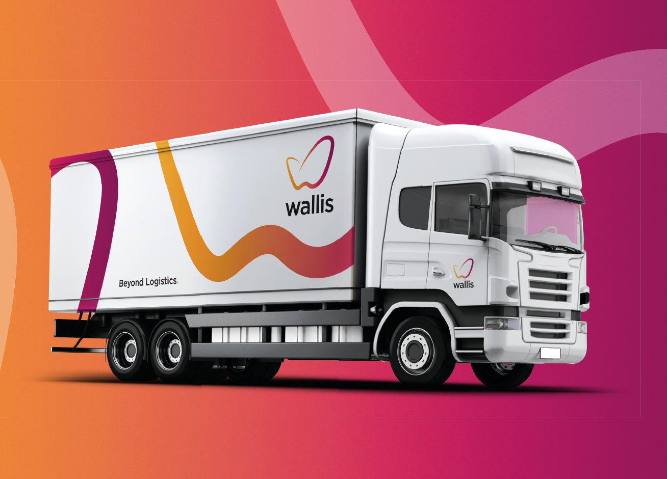
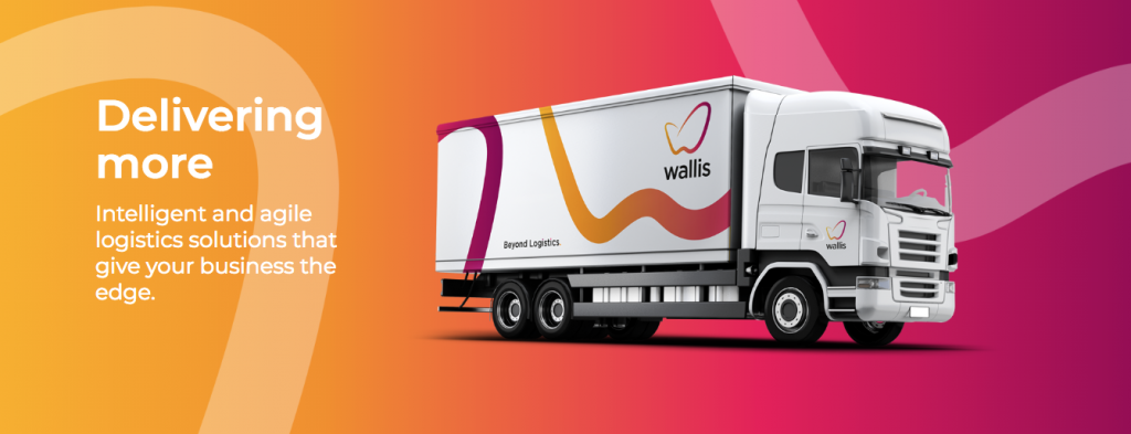
At this point, we were able to flesh-out a potential brand landscape for both options – in order to help with the client’s final decision-making. This included colour palettes, textural backgrounds, fonts and a treatment for the truck livery. Following due consideration the former fluid, butterfly-influenced ‘W’ lettering was selected as the outright winner.
The final design possesses a freshness and vibrancy that stands out within the sector – adding value right from the outset.
According to Nick Bennett, the designer behind the winning brand concept. ‘The signature-inspired W-form seemed the natural way to represent both the personal approach and the flexibility of Wallis’ business model. Moreover, when clients see the new colour combination, there can be no confusion and this means Wallis will stand out from the crowd.’
For more examples of how we go about delivering branding for the freight sector, please click here to view our sector portfolio.
To review our 6-step brand delivery process please view The Incorporated Brand
To discuss how we could support you with your logistics brand delivery please call Frank Norman on 01784 683000 or email