A logo is not just a mark – a logo reflects a business’s commercial brand via the use of shape, fonts, colour, and / or images. A logo inspiring trust, recognition and admiration for a company or product and it is our job as designers to create a logo that will do its job. The 5 main rules branding agencies work to are that:
1. A logo must be simple. A simple logo design allows for easy recognition and allows the logo to be versatile & memorable. Good logos feature something unexpected or unique without being overdrawn.
2. A logo must be memorable. Following closely behind the principle of simplicity, is that of memorability. An effective logo design should be memorable and this is achieved by having a simple, yet, appropriate logo.
3. A logo must be timeless. An effective logo should be timeless – that is, it will stand the test of time. Will the logo still be effective in 10, 20, 50 years?
4. A logo must be versatile. An effective logo should be able to work across a variety of mediums and applications. For this reason a logo should be designed in vector format, to ensure that it can be scaled to any size. The logo must work in just one colour too.
5. A logo must be appropriate. How you position the logo should be appropriate for its intended purpose. For example, if you are designing a logo for children’s toys store, it would be appropriate to use a childish font & color scheme. This would not be so appropriate for a law firm.
Of course, some logos are extremely clever in their design and simplicity, incorporating extra elements that backs up the values of that brand.
Check out the following 5 logos to see what I mean.
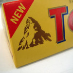
 < Toblerone
Do you see more than the Swiss Alps here in the Toblerone logo? Take another look and see if you can find a bear in the logo design. The story behind this is relatively simple. Toblerone originated in Bern, Switzerland – A city whose name is rumoured to mean, “City of Bears”.

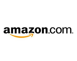
Amazon >
Amazon has gone through many logo changes since opening to the public in 1995. By 1998, the logo included a curved line underneath the company name so it looked like the web address was sitting on top of the world.
Two years later, the company changed logo again and the curved line was changed to an arrow starting from the a and ending at the z, obviously suggesting they offer everything from A to Z. In addition however, the arrow has been deliberately created to form a smiling face. Genius.
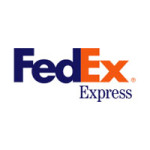
 < FedEx
And, keeping with the theme of an arrow, how many of you have really noticed the arrow embedded in the heart of the FedEx logo. Take a look between the E and the x to see how this has been designed.The logo has been designed this way so as to use the arrow to help convey speed, direction and reliability.

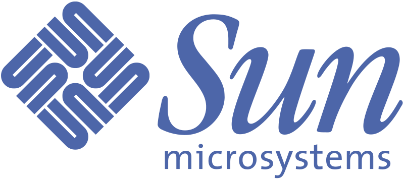
Sun Microsystems >
Look closely at the designed logo icon, what do you see? Does this say Sun to you? Look again, more closely this time.The logo has been designed using just one simple shape and duplicating this 8 times in different positions. The logo does not say ‘Sun’ at all, but you believe it does, from all 4 directions. Clever.
![]() < Kingfisher
< Kingfisher
My own favourite is the simple and delicately designed logo of Kingfisher, where the F and I in the centre of the word have been subtly designed and coloured to create the shape of the kingfisher bird. A kingfisher sitting perfectly within the word ‘Kingfisher’. Beautiful, simple, perfect.
Of course there are many other logo designs we could talk about. We would be keen to hear your thoughts on other cleverly-designed logos that you have seen. More information regarding branding services.
