
Sinerix
Back to PortfolioeSecureSign provided digital signatures & online verification solutions enabling legal compliance, less paperwork and much faster contract closures across secure digital transactions.
As the company was rapidly expanding, introducing more and more business solution, it was decided that a whole new brand identity was required.
Back to Portfolio
As with all branding projects, data is king and so our first stage was to get more insight into the company, its services, clients and the current brand. Understanding just how much of a ‘brand gap’ there was would help us shape the direction of new brand.
It wasn’t just visual identity that needed to change but the company name too and we took the client down six core ‘routes’, each one focusing on a different value of the service.
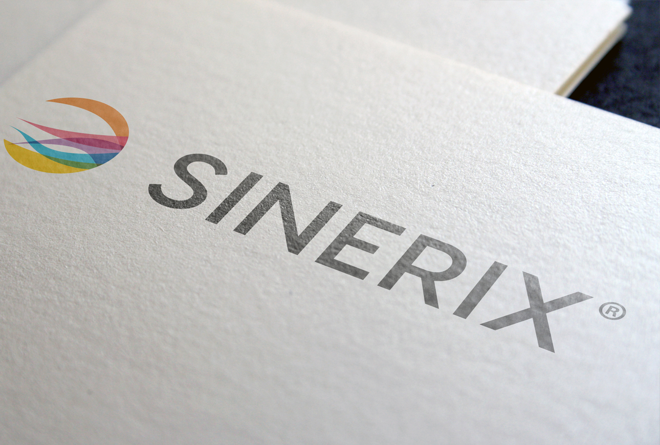
Of the six, the name Sinerix was selected. This was a pure simplification of the word signature along with the addition of the suffix ‘ics’ to denote a ‘field of study’. But, by subtly changing the suffix to ‘ix’, we were able to add a more ‘digital information’ feel.
Colourful brand identity
With the name Sinerix being defined as ‘the knowledge (or study) of signatures (or identification)‘ this was a fitting description of the company’s range of digital transaction solutions. And it was this range of solutions that became the focal point of planning for the visual identity.
It was understood that there was some crossover between some of the company’s services, and that the overall solution was enhanced when two or more services worked together. This led the branding team to work on a visual identity that would encapsulate all the different digital services within one graphical icon
The Sinerix brand, now owned by Virtual Signature, utilises a visual device that promotes a forward-moving flow of processes, all working hard together. This colourful brand identity sits alongside the company name in black.