
Freightline
Back to PortfolioDesign Inc are pleased to have devised & launched the new brand identity for Warwick-based global logistics specialist, Freightline Carriers.
The market-leading company specialises in time-critical deliveries via road and air freight as well as secure, state-of-the-art warehousing & distribution services.
Back to Portfolio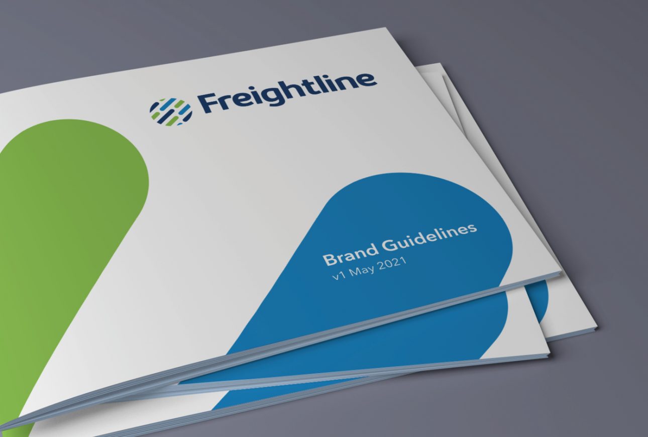
Logistics sector branding services
Ever since our beginnings in 1997, Design Inc has been based in Staines-upon-Thames, close to Heathrow Airport.
Being a branding agency on the doorstep of one of the world’s busiest travel hubs, it is no wonder that we are well-known for our logistics sector branding.
Of course, our reach goes further than the local area and, over the years, we have provided branding and marketing services to logistics companies large and small, all across the UK.
Warwick-based freight forwarders, Freightline Carriers contacted us in the Summer of 2021. They were looking for new branding and felt their current brand style was not hitting the right mark. We jumped at the chance to help.
The brand gap
Freightline Carriers approached us with a desire to update their corporate brand identity which they felt no longer portrayed their values and abilities.
Naturally, over time, many companies’ products, services & outlook change. And sometimes this can have an impact on their brand style/image. As was the case with Freightline Carriers, where they felt their brand style was looking old, fussy, confusing and no longer relevant to who they were now. This is the brand gap.
Design Inc’s logistics sector branding process enables us to understand and establish a company’s core values. This is crucial for us to audit & benchmark against the current brand and present a creative direction that would help reduce the brand gap.
The creative
The brand strategy led to us creating a new brand style which was underpinned by the new logo.
This was all based on a ‘less is more’ approach; firstly, we removed the word ‘Carriers’ from the brand. Not only did this compliment the fact they now more services than freight alone but also, by removing the word, we repositioned the company as a bigger, more confident, logistics specialist.
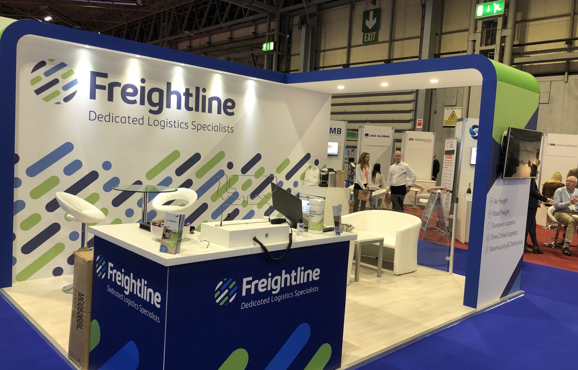
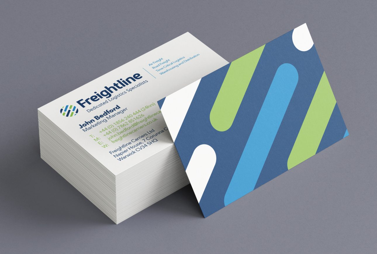
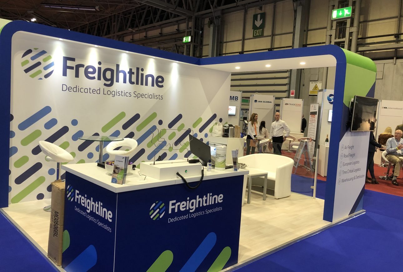
The name was accompanied by a new roundel device. This served to depict multiple specialisms working in harmony globally, the coloured lozenges within the roundel giving an added dimensions of structure, movement and speed.
Freightline’s wider brand style including patterns, shapes, backgrounds, imagery, etc was developed using the lozenge shapes within the roundel as the base. The end result being corporate marketing assets that were impactful, approachable and memorable.