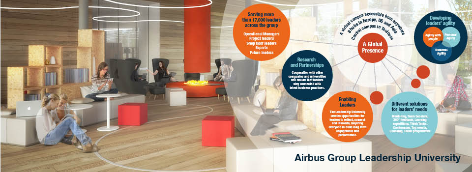
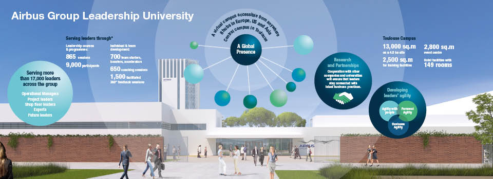
 Infographic design is an area of illustration that has seen a return to vogue in recent years. The Times newspaper for example using infographics regularly to explain the workings of the election or economy or immigration ‘at a glance’.
There are many categories of infographic.
- Comparison
- List
- Process
- Timeline
- Informational
- Statistical
- Hierarchical
So, whether you are trying to depict a company’s timeline or to simplify hundreds of key data points, the infographic can be simple or highly complex. But, the common factor is that it needs to be quickly understood. And this means designing the infographic with both creativity and strategy.
So, ensure you know two things:
1. what information you have got to work with
2. where do you want to take it
Your infographic should be educational, informative or entertaining and definitely not a sales message.
Design Inc have been supporting Airbus with infographic design as well as magazine cover concepts for their publication, Forum. Forum magazine now reaches 80,000 Airbus Group employees and, since the amalgamation with the external client, the publication now includes more content aimed at clients, prospects and other stakeholders.
Infographics are beautiful!
Moreover, we have recently been commissioned to design infographics for Bombardier to promote the latest features of their leading ranges of business aircraft. Another very interesting infographics task was to create an infographic design to present the ‘pound for pound’ variation in return on investment of expenditure in public health information campaigns. Long-term client Attenda has also recently asked us to look at ways to include infographics in their brand toolkit.
For more information on our illustration services including infographic design please speak with our Business Development Director Frank Norman.
To view more of our corporate publishing work please click here.
To visit our portfolio pages please click here.

