
Well designed logos are packed with meaning – all created to portray the brand / company values and to elicit a positive experience when we look at them. When branding agencies develop a logo, there are a number of factors they will consider in the way it is portrayed. This includes Colour, Shape, Font, Style & Composition.
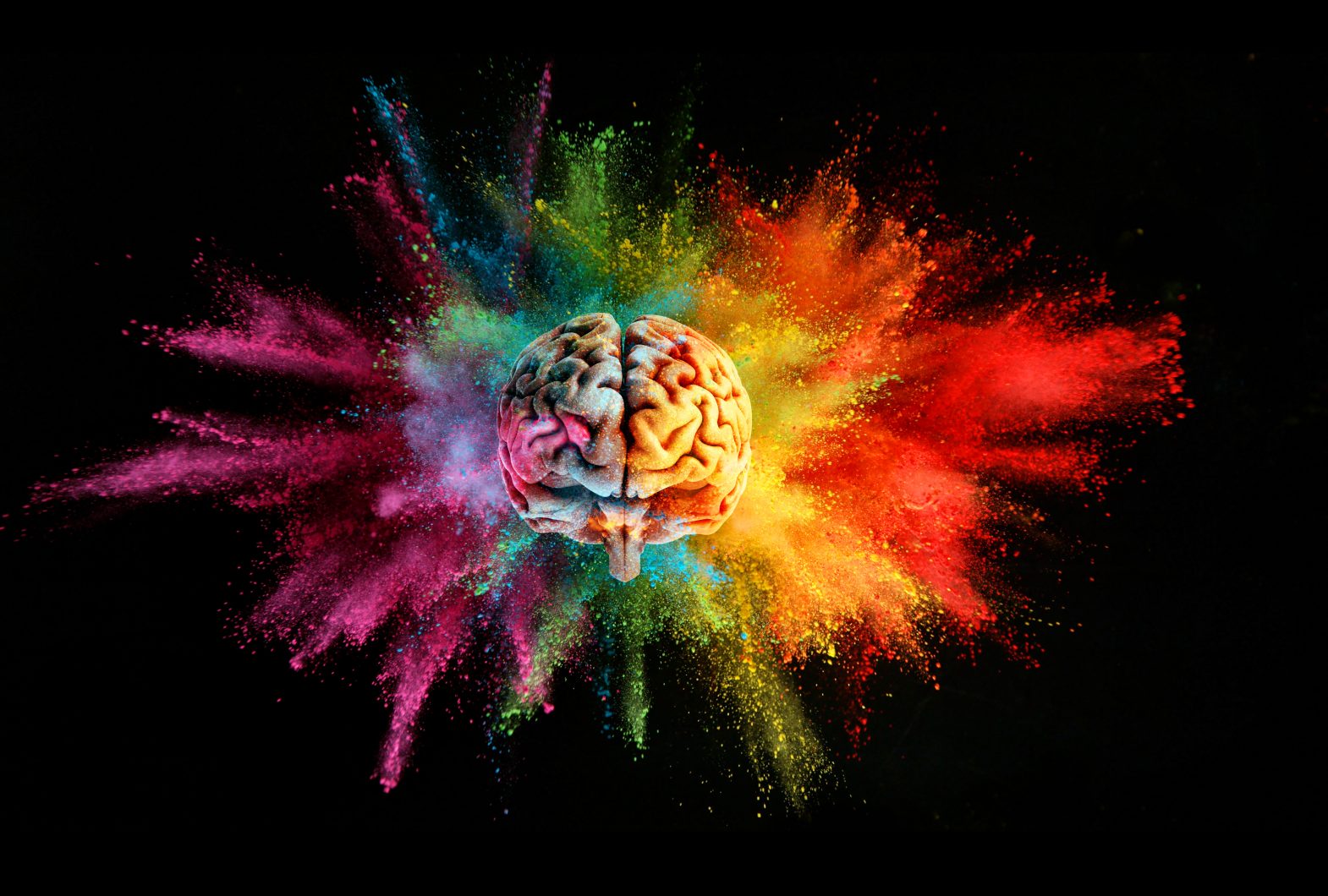
Today, we are considering the psychology of colour in branding and how the right colours in a logo can manipulate the viewer’s emotions.
Many books, papers, guides and blogs have been written about the psychology & meaning of colours and how they elicit different emotions in the viewer.
In fact, renowned psychologist, Carl Jung is credited as one of the pioneer’s in this field. He recognised that different colours influence perceptions that are not obvious, such as attractiveness, the taste of food or the effectiveness of stimulants, regressors and placebos.
Further studies have proved that colour can help shape and change attitude & behaviour. And this, of course, has a huge impact in marketing, as it can help a business establish trust and familiarity by eliciting the right emotions.
Studies have found that a product’s colour can influence 60 to 80% of a customer’s purchasing decision. So, not only is a colour able to strengthen the brand association, it can also affect sales. As an example, the combination of red and yellow has been found to stimulate hunger – its not a coincidence therefore that many fast food brands use this combination.
As a marketer, it is useful to explore how the use of colours can establish and send the right message to your target audience and influence them to make an impact on your business. This knowledge is key for creative, marketing and branding agencies when applying the principles of colour to a new branding project.
Looking at the world’s top brands, we can see that blue appears in 1 in 3 of brand logos. Moreover, 90% of brand use a maximum of two colours in their logo. As is expected with major brands, ‘less is more’.
So, let’s look at the psychology of colour in branding…
WHITE
White is often used when the brand is associated with purity. This covers feelings of peace, tranquility, hygiene, freshness & transparency. It is often used when the brand needs to convey innocence and elegance.

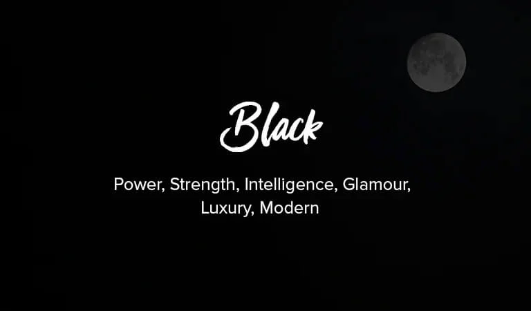
BLACK
Black is a pure colour and associated with control and all things serious. This creates a feeling of professionalism, power & authority. This colour is often used when the brand needs to make a powerful statement.
GREY
Grey is a neutral colour and is serious whilst being impartial. It creates a feeling of efficiency and support and is typically used as a secondary colour within a brand.

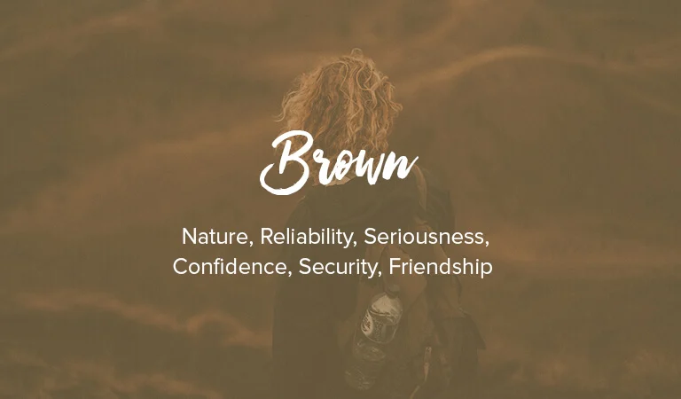
BROWN
Brown is the colour of earth and is associated with security. Like black, brown is serious but without its darker overtones. Brown is linked with humility, reliability and honesty and is often used by brands that want to be serious whilst being ‘down to earth’.
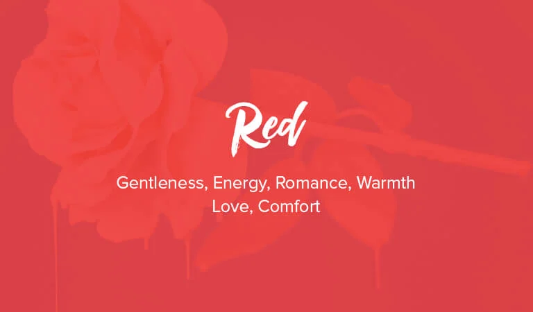
RED
Red is the colour of blood and the heart. As such, it is inherently linked to our base emotions – love, passion, romance, excitement & warmth. Moreover, it also is associated with danger, anger and warning.
Red is universally loud and attention-grabbing and often used in brands that want to make a bold statement to elicit an immediate response.
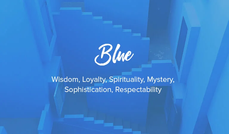
BLUE
Light blue is associated with clear skies, and is linked to the heavens and tranquility. This covers the feelings of trust, spirituality, healing and wisdom. It is often used where brands want to portray a sense of calm.
Dark blue also offers a feeling of trust but through authority, confidence and respectability.
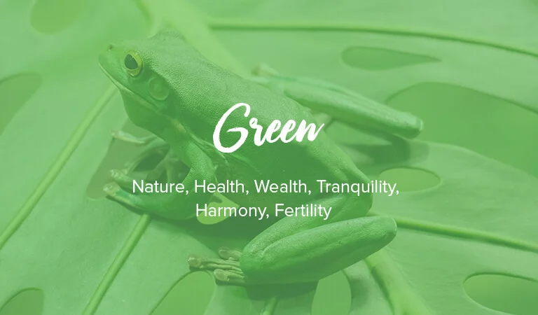
GREEN
Green is the colour of grass & vegetation and is therefore linked with the environment, nature and all things natural. This covers health, wealth and new beginnings (eg. fertility & growth). It is often used by brands wishing to portray themselves as healthy and balanced.
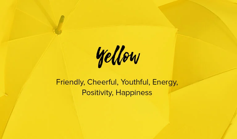
YELLOW
Yellow is associated with the sun and is linked to warmth. This covers happiness, joy & energy. This colour is often used by brands that wish to portray themselves as fun and positive.
ORANGE
Like yellow, orange is associated with the sun and is warm. But it is a lot more energetic. Orange elicits feelings of excitement, vitality, playfulness & action. It is often used by brands to instil a feeling of change.

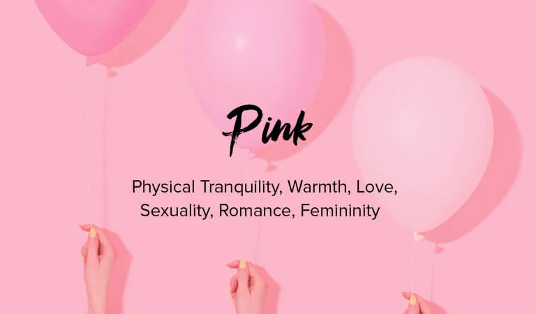
PINK
Pink is red’s playful younger sister and is linked to femininity. This covers innocence, romance, tranquility & youthfulness. This tends to be used by brands to promote a sense of the feminine.
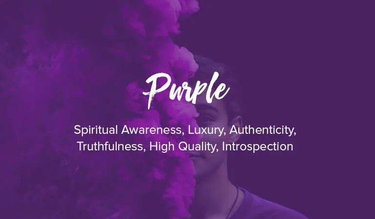
PURPLE
This colour is associated with quality and enlightenment. It creates a feeling of luxury, sophistication & creativity. This tends to be used by brands to portray themselves as higher (perceived) value and exclusivity.
Understanding the psychology of colour in branding is a vital step in the brand’s creative process. Colour lays the foundations for a brand’s message, meaning and emotion. Get it right, and you’ll ultimately help your brand maximise its potential.
See also:
>> Creating a Powerful Brand
>> Developing the Brand Name
>> What to do When all the Good Domain Names are Gone
>> The Importance of the Brand Audit
>> The Importance of Brand Guidelines