
![]()
We are pleased to unveil the new branding (including new brand name and new brand identity) for British, digital verification specialists, Sinerix.
The company provides digital signatures & online verification solutions enabling legal compliance, less paperwork and much faster contract closures across secure digital transactions. Originally called eSecureSign, the management were conscious that their business solution was growing in terms of functionality, and that their name needed to portray more than simply a secure electronic signature. As such, they made the decision to go out to tender for a new corporate brand identity and invited a number of branding agencies to pitch for the work. Design Inc was one of these companies.
Our strategic six-step approach to brand identity projects, such as this one, helped our proposal win the account and we quickly set to work on this project. Having already carried out a lot of investigation to help us with our proposal, we were in a good position to set to work on creating and sharing a branding brief document with our client which was subsequently approved.
The naming process involved the research into six creative naming ‘routes’. These led the way for brainstorming activity which elicited a large list of names. And, through a process of elimination and forwarding, we were able to compile a medium list of six names per ‘route’. And, within each of those six, we had proposed one as a major contender.
The client was presented with the long list, our medium list and the six final shortlisted recommendations along with underlying rationale and a list of available domain name opions. The final six names (one from each of the naming ‘routes’) included:
Edoc Docufy Sinerix Veridoc Signa Papyrus
In the client’s eyes, there was a clear winner: Sinerix. Simplifying the word signature and adding the suffix ‘ics’ to denote a ‘field of study’. And changing ‘ics’ to ‘ix’ to add a ‘digital information’ feel.
Sinerix could therefore be defined as ‘the knowledge (or study) of signatures (or identification)‘. A fitting description of the company’s range of digital transaction solutions.
And, upon this decision, we were quick to register the two domains: www.sinerix.com & www.sinerix.co.uk
The next part of the branding process was the design and formulation of a new company brand identity. Again, based on the information and insight gained through research, client interviews, competitor reviews, etc, a branding brief was established and shared with the client. This included our understanding of the required brand values, mandatories, goals and, like the naming strategy, included six creative style ‘routes’ into which we would invest our creative attention.
When a branding budget is limited, as in this case, we agree these creative ‘routes’ as a way of keeping on track. With large budgets, we have the time to invest 360 degrees worth of concepts. A limited budget however, does not present the same opportunity but, by agreeing the creative ‘routes’ for investigation, we are able to reach the goal within the time and budgets available.
In this case, the creative routes for investigation included:
Creative consideration route 1: An ID symbol (eg. signature, thumbprint, iris scan, etc)
Creative consideration route 2: A ‘device’ using just the letter S
Creative consideration route 3: A stylised font (for company name only)
Creative consideration route 4: Suggesting an exchange (of information)
Creative consideration route 5: Forward movement / flow
Creative consideration route 6: Technological (as the new name suggests)
After a couple of development stages, the client agreed upon a final brand identity, which was a combination of a couple of creative routes.
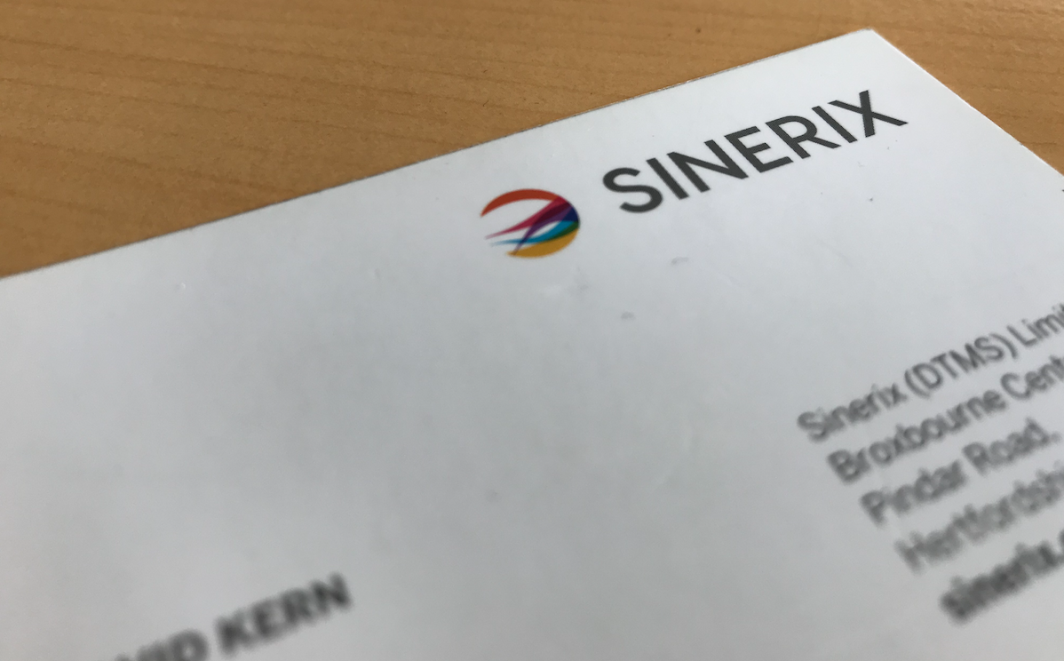
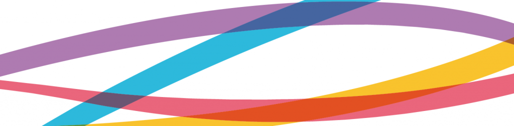
The new brand logo uses a bold, confident font for the company name along with a multicoloured flow of overlapping ‘ribbons’. The various coloured ribbons represent the various overarching solutions provided by the company. The forward moving ‘flow’ and overlapping of colours represents the exchange of information. Moreover, we kept this all within a circular shape to represent precision, perfection as well as a nod to the global aspirations of the business.
Needless to say the company was very pleased with the result and the new brand has since been rolled out across all marketing collateral. We look forward to continued support of this client.
The branding process can be a daunting experience but, in the hands of an experienced branding agency, you are safe in the knowledge their processes will deliver a result which exceeds your predefined branding goals.
To discuss your own brand identity requirements with our dedicated branding team, please call 01784 683000 or email our Business Development Director, Frank Norman
– View our Branding Portfolio
– View BrandWorks