

Background
Rock Flow Dynamics (RFD) offers a 21st century solution to reservoir modelling technology. Their flagship product, tNavigator is a powerful integrated software tool that enables combined 3D modelling of both subsea engineering and geological hydrocarbon field analysis in one interface.
tNavigator is used by over 200 commercial companies worldwide, from small consultancy businesses to major oil & gas operators. The niche market is dominated by a small number of historic players and there is a tendency towards inertia, sometimes due to legacy hardware write-down, amongst prospect companies. This can be a hurdle to converting sales.
An integrated approach
RFD is proactive and bold with its marketing. Their integrated approach includes large-scale bespoke stands at international exhibitions and of course magazine advertising for which we were brought in. Recent advertising campaigns have intentionally set out to be genre-challenging and have been rewarded by an offshore industry publishing award for the most memorable campaign. RFD likes to use the advertising assets in an experiential context and has also used campaign-based promotional giveaways.
Design Inc has a long held specialism of building a brand (see branding examples, here) for companies in the subsea, offshore and oil & gas sectors and are ideally placed to support RFD.
The brief
The RFD marketing team had identified that whilst previous campaigns provided standout, they were lacking in personality, character and accessibility. Ironically, the company itself has a fun culture based on ‘work hard – play hard’ and it was felt that some of this ‘attitude’ could benefit the advertising and projected image.
Our brief from RFD was a little unusual in that it specified that we should base our campaign on ‘characters’, but the ‘who’ and ‘what’ and the ‘style’ of these characters was to be established.
Building a brand character as a company brand asset is no mean feat but, get it correct and the rewards from brand loyalty can be highly significant..
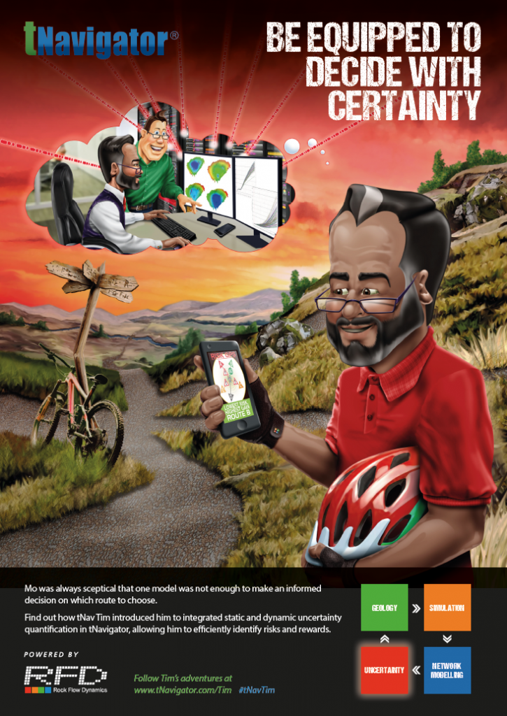
The solution required was to include the development of a number of client-based characters who were profiled around the different professional roles of those who gain most benefit from the use of tNavigator. These were to include an ‘early adopter’ who trail blazes the use of tNavigator within the client’s organisation.
Each advert in the series would introduce a different character and address their own particular challenge which tNavigator would solve. These challenges would align with the 4 main attributes of the software:
Reservoir Simulation
Geology
Surface Network Modelling
Uncertainty Analysis
The approach
Following our pitch, which included a number of alternative environments and narratives for the characters, as well as graphic treatments for the illustrations, a CGI cartoon style was the preferred styling treatment. This served to bring vibrant colour and a ‘larger than life’ fun element to the campaign. This, in itself, would be a metaphor for the next generation appearance of the tNavigator software screen.
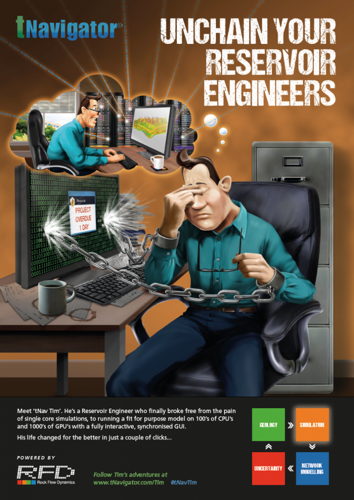
In the first execution, we meet the main character and early adopter, called tNav Tim who would, in each subsequent advert, help educate a new user with the benefits of the software.
By the end of the series of advertisements, this tNavigator ‘effect’ has permeated across the organisation with different departments all sharing their experiences and becoming full-on advocates for RFD.
Building a brand character
The creation of a character is a multi-stage process. With so many options available, we needed to establish a route for development. This started with us agreeing what sort of character this should be? For example: human, human-like, animal, object, etc. And, following that, understanding the illustration type: illustration, cartoon, 3D, etc
And then, adding the characteristics: height, size, clothing, mannerisms, etc
We decided on creating tNav Tim as a human cartoon but knew that we wanted to add some subtle non-human-like features. Staring with a few head shape styles we began to establish a 2 dimensional look for the character.
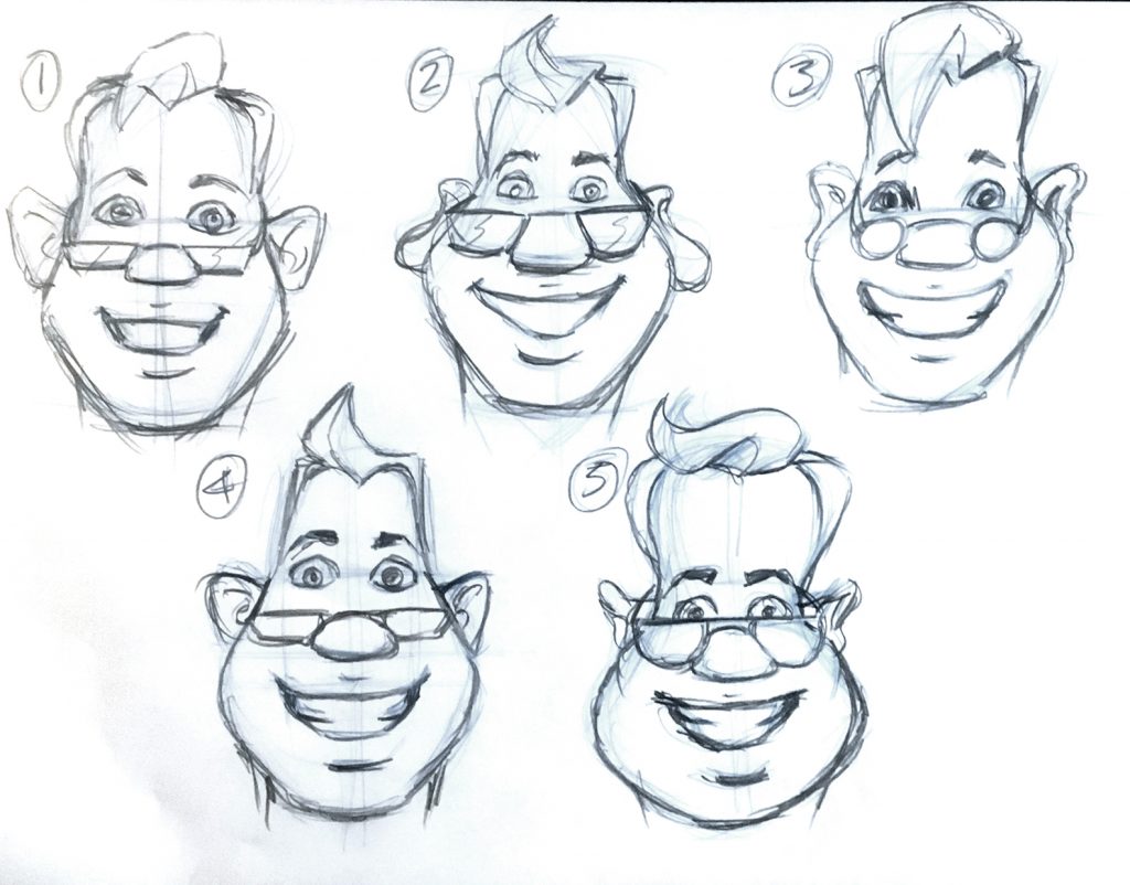
Option 4 was selected and this allowed us to develop the face further, bringing a focus on the character’s smile and hair.

The next stage would see us working on the character’s style: size, clothing, colour schemes, etc.

Adding personality
When building a brand character, it is important that we can breathe some life into the character and give them a personality. Their look, age, ethnicity, clothing, stance were all considered in depth. More importantly, we also introduced their hobbies & interests into the mix by showing them outside their work environment. This included:
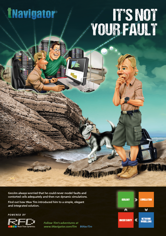
– GeoJim, the geologist was a keen fossil hunter

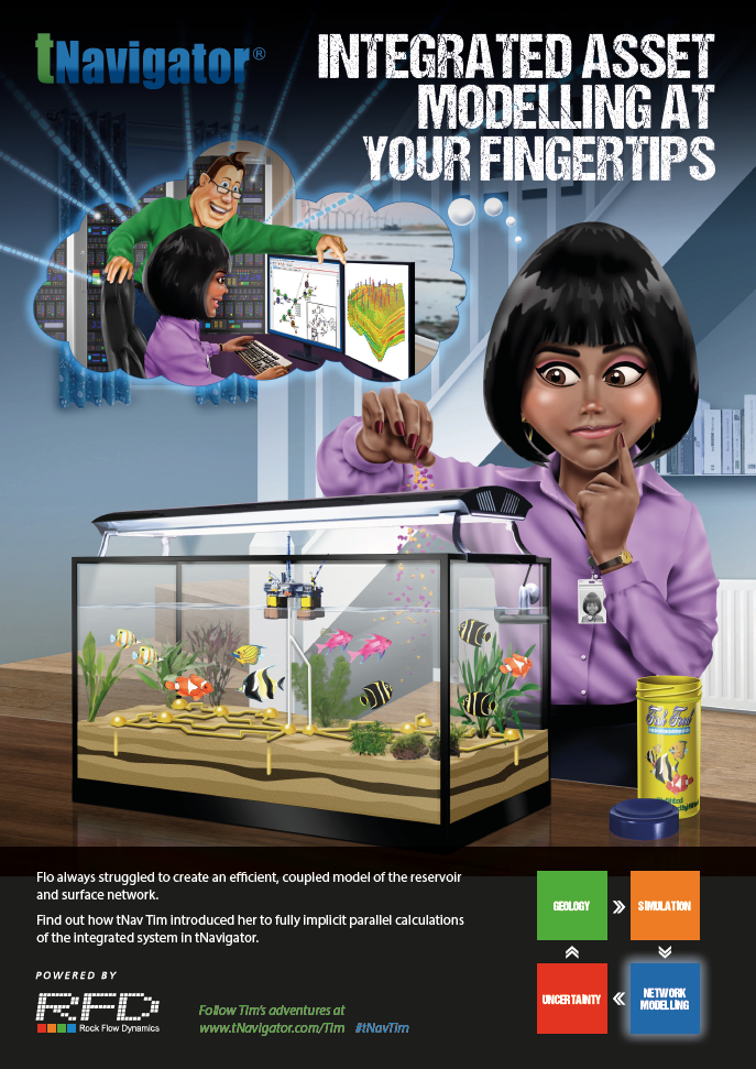
– Flo, the Production Engineer was passionate about tropical fish

– Mo, the Subsurface Manager, was a keen cyclist.

The campaign, which currently has four executions will appear in the sector’s key print publications including ‘Oil & Gas Journal’.
Taking Tim on the road
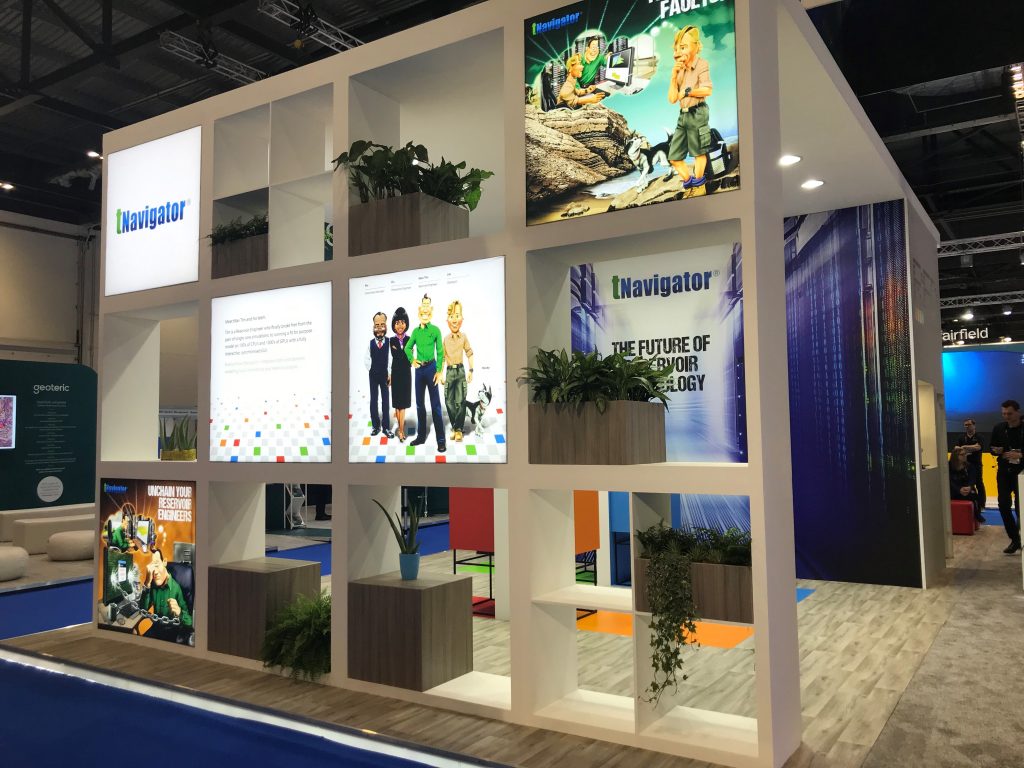
RFD have also taken Tim on the road this year, with the campaign and characters making an appearance at exhibitions. Large graphic prints of the characters and enlargements of the adverts themselves have been used to bring a fresh and approachable feel to the RFD stands at key oil & gas industry events around the world.
Tim, Jim, Flo and Mo have been used both within the regional back drops and as freestanding life size cut-outs positioned around the stand for selfie-takers. Many of these photos have since made their way to social media. One of the additional benefits of a character-based campaign is the potential for merchandising and Tim has already lent himself to creative promotional giveaways.
Client Testimonial
“We have loved working with Design Inc on our most recent marketing campaign, we’re delighted with the outcome so far.
Frank and his team always come up with an amazing, creative concepts, even when presented with our crazy ideas. They really took the time to understand our company and the messages we are trying to portray through our advertising, which has helped us to further develop our brand image and stand out in our market.
Thanks Design Inc team, we look forward to continuing our partnership!”
>>Up Against Time: Nice Airport Advertising for Rock Flow Dynamics
>>Devising the Fantastic 2020 Puzzle Calendar for RFD
>>Why You Should be Using Cartoons in Marketing
>>Brand Engagement with Super Powers